How I Organize My Stylesheets
An excerpt from my upcoming course for The Spicy Web on how to write modern, maintainable vanilla CSS using sound architectural principles, slated for release in January 2023.
 By Jared White
There are only two hard things in Computer Science: cache invalidation and naming things.
–Phil Karlton
Yeah, we’ve all heard this line before. But like with many truisms, there’s actually a lot of truth to this. Naming things (and cache invalidation for that matter) can be quite challenging.
Some people like finding solutions where they don’t have to name things. Or at least the names can be more practical and immediate, less philosophical and “big picture”. A function name like gonculateWidgetData makes sense if you’re writing a function to, well, gonculate the widget data. Right?? If you had to employ a more abstracted Object-Oriented pattern, you’d have to figure out what the Widget represents and then figure out how to model the Data and then figure out which object (or another one entirely) is responsible for the final gonculating. Too much work! Too confusing! It’ll Take Too Long!
As for me, I find “naming things” to be one of the most satisfying and rewarding aspects of programming. I’m a weirdo like that. Rather than a step I’d like to remove or reduce as much as possible, I want to spend copious amounts of time on it. I’ve often found that the more time you spend up front figuring out the ubiquitous language of your problem domain and visualizing the high-level concerns of your codebase before slowly working inward to fill in the details, the more you get your product right the first time in terms of code comprehension and maintainability.
So when it comes to the design of your website and the “how” of writing CSS to achieve your design goals, I always think it’s best to start at the highest conceptual level and then methodically work your way down the line.
The Pyramid Approach to Styling #
Brad Frost, well-known for advocating for design systems in web UI, created this simple chart which I appreciate:
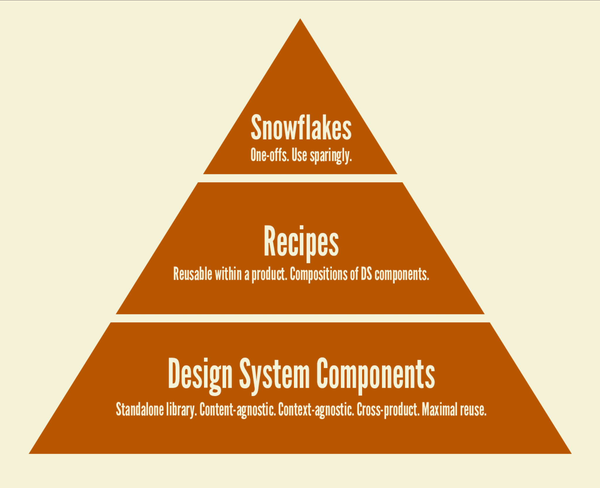
I like the way this shows a clear progression from the global to the specific. You start with reusable, content-and-context-agnostic components (and we’ll start our conversation even deeper in the stack with system-wide, mostly “classless” HTML stylesheets).
Then you progress to combinations of components which themselves form common patterns you might encounter multiple times throughout a project.
Then finally you progress to those “one-offs” — bespoke designs you might need to work on occasionally (with new custom styles in tow) but are hopefully rare.
For the rest of this article, let’s take a look at an approach to organizing the global stylesheets which sit at the very base of this stack.
The Entrypoint: index.css #
Assuming you have a folder we’ll call styles in which you can add multiple stylesheet files, let’s take a look at your “entrypoint” file, typically named index.css.
The question of what you put in your index stylesheet, or how much, has varied for me over the years, but I’ve come to the point where I put nothing in it but imports. @import turtles all the way down! Thus index.css itself doesn’t do anything. It’s simply serves as the baseplate upon which you set up everything else.
So the next question is: what exactly do you import?
Design Tokens & Global Styles #
The first category of imports I’d recommend is fonts and design tokens. If you have specific font stylesheets which reference related font files, you can import those right away. Then import the stylesheet(s) for your design tokens. We’ll be covering design tokens in-depth in my upcoming CSS course. Maybe you have just a single variables.css file with all of your tokens. Or you could break them out into categories like colors.css, sizes.css, fonts.css, etc. It really just depends on the size of your project. And of course, as your project scales, it may make sense to go from one file to several.
Next, I import a stylesheet I typically call global.css. This covers the most basic aspects of styling your HTML, with selectors such as body, a, main, hr, etc. as well as a few “reset” rules such as box-sizing: border-box. If you prefer, you can create your own reset.css or normalize.css file and import that before you import global.css.
Depending on the size of your project, you can put basic typographical style rules in global.css for tags like h1, p, blockquote, etc. — or you can break those out into a stylesheet you might call something like typography.css.
Also depending on the size of your project, you can add default styles for form, input, button, etc. in global.css — or you can break those out into a forms.css file.
Design Categories #
From here on out, I might create a few different stylesheets for various categories of design work across the site. For example:
layout.css(for setting up styles for common layouts throughout your HTML templates)lists.css(if you have multiple variants oful/ol/dl/etc. styles)tables.css(for HTML tables)content.css(for prose sections, blogging concerns, Markdown, etc.)syntax.css(if you need to display any code or other technical data)
Page-Specific Style Rules #
This has always been a bit of a code smell, but I think it’s foolish to ignore the fact that at one point or another you’re going to have a page (or a layout template) on your site where you need something tweaked at the page-level. In those cases, I put a special class on body and then use that to scope a few choice rules. For example, if you use <body class="calendar"> for an Events Calendar page, you can then use that for scoping:
body.calendar > header h1 {
  font-family: var(--font-fancy);
}
I highly recommend being prudent in authoring any page-specific style rules. Remember the pyramid graph shown above? You want to maximize the amount of work you do lower in the stack and minimize “one-offs”.
Try as much as possible to use component variants on various page templates to achieve your goals for a markup-based solution to this problem. I also strongly discourage ever authoring standalone, page-specific stylesheets. In other words, if you ever find yourself creating an events-calendar.css to style an Events Calendar page, you’re doing it wrong. That would be a clear example of the dreaded “append-only” problem of authoring stylesheets—a road which leads to madness. Instead, try to find ways to contain scoped style rules at the component level.
For instance, we could express the above example by defining a true header component, where one variant of that header component would be to use the “fancy” font for its title. Then, in the markup for the Events Calendar, you could utilize that header variant in markup, rather than relying on a custom body class and related CSS. We’ll be covering designing with component variants in my upcoming CSS course.
That being said, don’t let the perfect be the enemy of the good. If you only adhere rigidly to component-scoped styles and refuse ever to style anything at the page level, you’ll occasionally find yourself introducing unnecessary complexity to your design system. If you have 50 different types of pages on your site and find that one needs something unique for aesthetic or content-centric reasons, there’s no shame in adding a few body.snowflake rules to a pages.css file.
Vendor Stylesheets #
This isn’t as common any more with the arrival of the NPM ecosystem and bundlers, but you may still find yourself needing to download a stylesheet or two for a particular package/plugin/add-on (whatever you want to call it). In those cases, you can create a vendor folder within styles and sequester everything there (and then import accordingly).
Small Project Examples #
So putting that all together, let’s look at the folder structure of couple of examples of small projects where you only need a handful of stylesheet files. (We’ll sort by order of import, not alphabetically.)
stylesindex.cssvariables.cssglobal.csscontent.css
Or:
stylesindex.css- (font stylesheets in another folder)
global.csscontent.csssyntax.css
Large Project Example #
Now let’s look at a larger project which breaks out quite a few files (and you’d almost certainly want to be using some kind of bundler in this scenario so the browser doesn’t have to download literally dozens of files…or are we past worrying about that in the HTTP/2 era? YMMV).
stylesindex.cssvariablesborders.csscolors.cssfonts.csssizes.css
global.csslayout.csstypography.cssforms.csslists.csstables.csscontent.csspages.cssvendorsome_3rd_party_package.css
I honestly wouldn’t recommend such a sophisticated set of files right off the bat, unless you know in advance your project will grow exponentially. There’s little harm in starting with fewer files, then moving some style rules into new files when/if that’s necessary for code comprehension. I’d rather do that then start out with a slew of files where each file only has a few lines for an extended period of time. You’ll be jumping around files way too often.
What You Won’t Find in These Examples #
So far we’ve covered how to organize your stylesheets at somewhat of a “macro” level across your website project, but we haven’t yet covered where you may actually spend the bulk of your styling time (on larger projects at least) which is: the component library.
I feel pretty strongly about the fact that your component-level stylesheets should not live alongside your “global” stylesheets. In other words, you should not be putting cards.css or navbar.css or accordion.css next to typography.css and layout.css.
Our global-level stylesheets are mostly concerned with styling semantic HTML tags, common layouts, and perhaps a handful of custom elements which aren’t really “components” in the Web-Components-Written-In-JavaScript sense of the word.
For bona fide components, I recommend putting your stylesheets right alongside your component .js files and other component-related files, and your components will likely live inside folders named for those components (or at least component categories). We’ll cover all this in-depth in my upcoming CSS course.
In cases where you’re importing a third-party component library such as Shoelace and not merely building your own components from scratch, you may not need to spend much time with the setup of a component library folder structure. Instead, you might just author one stylesheet with any “overrides” for the third-party library so it matches your own design. For instance, in one project I literally have a global shoelace-customizations.css file where I tweak some of Shoelace’s design tokens and change a few component styles here and there via ::part selectors. Things like:
sl-dialog::part(panel) {
  filter: blur(6px);
  transition: var(--sl-transition-medium) opacity,
    var(--sl-transition-medium) transform, 0.5s filter;
}
sl-dialog[open]::part(panel) {
  filter: blur(0);
}
This adds a slight “blur” effect to Shoelace dialog boxes as they open and close.
How to Communicate Your Stylesheet Organizational Approach to Newbies #
If you’re working on a solo project, you can probably just skip over this section. But on any project of a particular size where you’ll be interacting with other team members or contributors, you’ll likely want to document your approach to stylesheet organization.
Arguably a benefit to using an off-the-shelf CSS framework like Bootstrap or Tailwind is you get “documentation for free” — aka someone jumping into the project may already have knowledge of Bootstrap/Tailwind/etc. Or if they don’t, the docs are online for everyone to see.
In your bespoke vanilla CSS setup, it’s could be anything. Could be utterly bewildering. Or it could be logical and simple to grok.
That’s up to you. So for the love of all that is semantic, please take the time to write up some documentation. Doesn’t have to be anything fancy. I recommend sticking a Markdown file right in your repo, perhaps just leveraging your README. Or you can build documentation into something like Storybook or a style guide which would really kick ass—especially as you get into more advanced component design. We’ll cover implementing style guides/Storybook/etc. in my upcoming CSS course.
I also highly recommend liberally sprinkling your stylesheets with comments to break up various groupings or categories of rules within a single file. If you must err on any side, I certainly advocate for erring on the side of “too many comments” rather than too few.
So with good documentation in place, if a contributor is wondering “how do I style this particular hero in the header” or “how do I tweak the layout of my form on this particular screen”, you should already have the answers to those questions. Or you should be close enough that if you point the contributor to a certain stylesheet or code example, they’ll be able to get up to speed quickly.
In summary, the answer to “stylesheets run amuck” and “bespoke CSS hell” and all the other complaints you typically hear isn’t to just throw up your hands and abandon vanilla CSS. It’s to do a better job writing vanilla CSS. It’s a skill just like any other—a skill you can learn and impart to others. I’ve done it. Many, many devs have done it. You can do it too.