Listen to or download an audio recording of this episode.
Div Tag Soup Begone
Or…the Evolution of the Dialog Box #
Modals. Dialogs. Modal Dialogs. You know what I’m talking about. It’s that thing which pops up in your face and annoys you so you try to click OK as quickly as possible (and then wonder for a split second if “OK” meant “OK to save the document” or “OK, let’s delete your document now” … 😱)
Setting aside the fact that HTML literally has a <dialog> element now (which is freaking rad), I’d like to take a look at the evolution of a dialog box on the web. Specifically, how we write the markup for it in our HTML.
Let’s first take a look at a dialog written in Bootstrap 1.0 circa 2011.
<div class="modal">
  <div class="modal-header">
    <h3>Modal Heading</h3>
    <a href="#" class="close">×</a>
  </div>
  <div class="modal-body">
    <p>One fine body...</p>
  </div>
  <div class="modal-footer">
    <a href="" class="btn primary">Primary</a>
    <a href="" class="btn secondary">Secondary</a>
  </div>
</div>
OK, not too shabby for 2011. Pretty clean markup. Gosh, no wonder Bootstrap caught on! 😄
Now let’s take a look at ZURB Foundation, another popular mid-2010s CSS framework:
<div class="reveal" id="exampleModal1" data-reveal>
<h1>Modal Heading</h1>
<p>I'm a cool paragraph that lives inside of an even cooler modal.</p>
<footer class="button-group align-right">
<a class="button">Secondary</a>
<a class="button success">Primary</a>
</footer>
<button class="close-button" data-close aria-label="Close reveal" type="button">
<span aria-hidden="true">×</span>
</button>
</div>
OK, a little less clean perhaps but still along the lines of what we’d expect from that era.
Let’s look now at the output from Chakra, a popular React UI component library.
<section class="chakra-modal__content css-pv22qu" role="dialog" id="chakra-modal-:ra:" tabindex="-1" aria-modal="true" style="opacity: 1; transform: none;" aria-labelledby="chakra-modal--header-:ra:" aria-describedby="chakra-modal--body-:ra:">
  <header class="chakra-modal__header css-9fgtzh" id="chakra-modal--header-:ra:">Modal Title</header>
  <button type="button" aria-label="Close" class="chakra-modal__close-btn css-1ik4h6n">
    <svg ...><!-- snipped out for brevity --></svg>
  </button>
  <div class="chakra-modal__body css-qlig70" id="chakra-modal--body-:ra:">
    <div>
      <p>Sit nulla est ex deserunt exercitation anim occaecat. Nostrud ullamco deserunt aute id consequat veniam incididunt duis in sint irure nisi. Mollit officia cillum Lorem ullamco minim nostrud elit officia tempor esse quis.</p>
    </div>
  </div>
  <footer class="chakra-modal__footer css-k0waxj">
    <button type="button" class="chakra-button css-f2hjvb">Close</button>
    <button type="button" class="chakra-button css-1x4o3bv">Secondary Action</button>
  </footer>
</section>
OK, this is starting to make my eyes bleed a little. Glad I’m not responsible for manually typing all this out in my HTML code editor!
Finally, let’s look at the modal in Flowbite, a popular Tailwind-based component library:
<div id="defaultModal" tabindex="-1" aria-hidden="true" class="fixed top-0 left-0 right-0 z-50 hidden w-full p-4 overflow-x-hidden overflow-y-auto md:inset-0 h-[calc(100%-1rem)] md:h-full">
  <div class="relative w-full h-full max-w-2xl md:h-auto">
    <!-- Modal content -->
    <div class="relative bg-white rounded-lg shadow dark:bg-gray-700">
      <!-- Modal header -->
      <div class="flex items-start justify-between p-4 border-b rounded-t dark:border-gray-600">
        <h3 class="text-xl font-semibold text-gray-900 dark:text-white">Terms of Service</h3>
          <button type="button" class="text-gray-400 bg-transparent hover:bg-gray-200 hover:text-gray-900 rounded-lg text-sm p-1.5 ml-auto inline-flex items-center dark:hover:bg-gray-600 dark:hover:text-white" data-modal-hide="defaultModal">
          <svg ...><!-- snipped out for brevity --></svg>
          <span class="sr-only">Close modal</span>
        </button>
      </div>
      <!-- Modal body -->
      <div class="p-6 space-y-6">
        <p class="text-base leading-relaxed text-gray-500 dark:text-gray-400">
          With less than a month to go before the European Union enacts new consumer privacy laws for its citizens, companies around the world are updating their terms of service agreements to comply.
        </p>
      </div>
      <!-- Modal footer -->
      <div class="flex items-center p-6 space-x-2 border-t border-gray-200 rounded-b dark:border-gray-600">
        <button data-modal-hide="defaultModal" type="button" class="text-white bg-blue-700 hover:bg-blue-800 focus:ring-4 focus:outline-none focus:ring-blue-300 font-medium rounded-lg text-sm px-5 py-2.5 text-center dark:bg-blue-600 dark:hover:bg-blue-700 dark:focus:ring-blue-800">I accept</button>
        <button data-modal-hide="defaultModal" type="button" class="text-gray-500 bg-white hover:bg-gray-100 focus:ring-4 focus:outline-none focus:ring-blue-300 rounded-lg border border-gray-200 text-sm font-medium px-5 py-2.5 hover:text-gray-900 focus:z-10 dark:bg-gray-700 dark:text-gray-300 dark:border-gray-500 dark:hover:text-white dark:hover:bg-gray-600 dark:focus:ring-gray-600">Decline</button>
      </div>
    </div>
  </div>
</div>
Oh god. 😵💫 Oww. Eww.
(Listen, I actually think Flowbite looks really nice and is one of the best-designed Tailwind component libraries out there. But I never, ever want to see this markup ever again! Ever!)
Tag Soup is Getting Worse, Not Better #
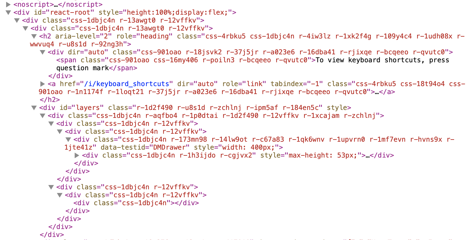
No matter where you look, tag soup is exploding all over the web. As of the time of this writing, Microsoft had recently announced a new product called Loop. When you go to their splashy marketing page and peek under the hood, there is an insane number of <div> tags. I had to hunt for a <div> tag 10 levels deep before I could get to the very first “Get Started” button that’s at the very top of the page! And this is just a marketing page! It’s not an app at all! It doesn’t really even do anything!
I’m not picking on Microsoft here. I see this all the time. And frankly, it’s unacceptable.
The web is not your abstraction’s dumping ground and HTML is not a “build target”.
I know you’re reading a CSS course here and not an HTML course per se, but the reason I’m spending multiple episodes of this season of CSS Nouveau constantly harping on the need to write concise, readable, maintainable, semantic HTML is because great stylesheets are built brick by brick on top of great HTML.
If your HTML is garbage, your stylesheets are garbage.
If your HTML is fantastic, chances are your stylesheets are pretty decent.
If I go to your website and your markup looks like this:
It tells me something. It tells me that you don’t know how to write vanilla CSS. Because nobody writing vanilla CSS is going to stand working in an environment which produces this nonsense. No way.
You can do better. I can do better. We can do better. The web deserves us all to do much, much better.
Thankfully, It Doesn’t Have to Be Like This #
Back to the venerable dialog. Remember all those examples above? Compare those with a dialog from Shoelace, a web component library:
<sl-dialog label="Modal Heading">
  <p>One fine body...</p>
  <sl-button slot="footer" variant="primary">Primary</sl-button>
  <sl-button slot="footer" variant="secondary">Secondary</sl-button>
</sl-dialog>
This is literally the only example I can think of that’s simpler than the Bootstrap v1 example—otherwise it’s all been downhill from there.
What I truly love about this example is there’s nothing wasted. Nothing is there simply for the computer’s sake. It’s all content. It all means something. I can explain to you what literally every character in this text snippet does and why it’s there.
But wait a minute! I hear you saying. You’re cheating! Most of the markup in Shoelace’s dialog is encapsulated within its shadow DOM! You’re not seeing that here! It’s all hidden away!
Exactly. That’s the whole damn point. 😅
I like to talk a lot about “defaults” when discussing code patterns, techniques, and technologies. I like to talk about what the default should be when approaching a problem. There are always use cases and project requirements which necessitate solutions that are messier, harder, or more complicated. That’s fine. But it doesn’t mean they should be the default.
Chakra’s HTML output shouldn’t be a default for the web.
Flowbite’s HTML output shouldn’t be a default for the web.
Bootstrap and Foundation and Bulma and all the other “legacy” CSS frameworks should no longer be a default for the web.
Something along the lines of that Shoelace example should be a default for the web.
Don’t believe me? Think I’m just shilling for Shoelace? Look at Adobe’s Spectrum dialog markup. Equally brief and straightforward!
<sp-dialog size="s">
  <h2 slot="heading">A thing is about to happen</h2>
  <p>Something that might happen a lot is about to happen.</p>
  <sp-button variant="secondary" treatment="fill" slot="button">OK</sp-button>
  <sp-checkbox slot="footer">Don't show me this again</sp-checkbox>
</sp-dialog>
Here’s the deal: I want to be able to write HTML markup that’s stupidly simple and human readable as well as writable. I don’t think that’s too much to ask. And I don’t want your build tools and your weird-ass frameworks and your abstractions. I want the thing I’m writing to be the thing I’m seeing in the browser when I inspect it.
What’s the opposite of GIGO (Garbage In, Garbage Out)? Whatever that is, that’s what I want.
I want to be able to leverage architectural layers and compositional patterns which are now built-in to every web browser. It’s comforting to know there’s nothing magical about the Shoelace or the Spectrum examples. They are simply leveraging what’s truly modern, what’s truly “cutting-edge” about HTML, CSS, and JavaScript today.
But Jared, I don’t like web components and this whole “shadow DOM” thing. That stuff is weird and people keep telling me they’re icky and not accessible and SEO doesn’t work and SSR doesn’t work. Why are you forcing me to use it?
I will admit, there’s plenty of FUD (Fear, Uncertainty, and Doubt) around web components out there. Heck, even people who recommend using custom elements/web components for various things often promote outdated or incoherent notions of what’s appropriate or compatible.
A rule of thumb I’ve come to adhere to when it comes to web components is this: CodePen or it didn’t happen.
Unless you can demonstrate with a concrete example why a web components spec is weird/broken/non-useful and you can also demonstrate there’s no available workaround or simple polyfill, I’m just going to assume you haven’t done your due diligence.
But listen, I’m not yet saying we need to dive into styling with the shadow DOM. You can build web components without it, with only “light DOM” as it were.
In fact, let’s invent our own shadow DOM-less markup right now!
<simple-modal role="dialog" aria-labelledby="dialog1Title" aria-describedby="dialog1Desc">
  <header>
    <h3 id="dialog1Title">Modal Heading</h3>
    <simple-modal-close><button>×</button></simple-modal-close>
  </header>
  <section>
    <p id="dialog1Desc">One fine body...</p>
  </section>
  <footer>
    <simple-button variant="primary"><a href="">Primary</a></simple-button>
    <simple-button variant="secondary"><a href="">Secondary</a></simple-button>
  </footer>
</simple-modal>
See! That wasn’t so hard. And we haven’t even tried leveraging <dialog> yet, which we probably should, and which provides an dialog ARIA role right out of the (dialog) box…cool beans.
My circa-2023 philosophy of how to write markup is really rather simple. Imagine you’re writing a web component with shadow DOM, even if you’re not writing a web component with shadow DOM. Picture in your mind how the composition works, where you’d place your slots, how you’d set up the content flow, what you’d name different “parts”, etc. And then simply do all that in “light DOM” as best you can.
You might even literally use something like data-part in your markup:
<product-card>
  <p data-part="price">$14.95</p>
  <p data-part="description">This is a great product.</p>
  <footer data-part="purchase">
    <button>Buy Me Now!</button>
  </footer>
</product-card>
Isn’t that just peachy? Now when you go to write your stylesheet, you can reference these “parts” directly:
product-card {
  display: block;
}

product-card > [data-part="price"] {

}

product-card > [data-part="description"] {

}
The nice thing about doing it this way is if you later want to move to a true web component + shadow DOM arrangement, it’s not that conceptually hard:
<product-card>
  <!-- Shadow DOM: -->
  <template shadowrootmode="open">
    <slot part="price" name="price"></slot>
    <slot part="description" name="description"></slot>
    <slot part="purchase" name="purchase"></slot>

    <style>
      slot[part="price"] {

      }

      slot[part="description"] {

      }
    </style>
  </template>

  <!-- Light DOM: -->

  <p slot="price">$14.95</p>
  <p slot="description">This is a great product.</p>

  <footer slot="purchase">
    <my-button>Buy Me Now!</my-button>
  </footer>
</product-card>
(And yes, before you ask, you can directly style <slot> tags. They’re display: contents by default but you can easily override that.)
Zooming out a bit, I’m hoping you can start to see a pattern here in all of these various example. And that pattern in this:
Your HTML doesn’t exist to serve the needs of your styling. Your CSS exists to serve the needs of your content structure.
This was much, much harder to do in years past, which is why we all got into the terribly bad habit of littering our HTML with tag and class soup. But we simply don’t need to do that anymore.
Ubiquitous Language #
Ubiquitous language is a concept taken from Domain-Driven Design which tries to harmonize the terminology and understanding of the domain of a software product with the terminology and understanding of the software developers’ needs. When terms don’t line up, we can run into real problems communicating what needs to be built and how to build it.
Here’s an example from my own experience.
As a web developer, when I look at the header of a web page and see a horizontal list of links, I think of them as “nav bar links or items”.
But regularly, clients and other folks I talk to call them “tabs”.
I’d like to add a new tab to the website.
Now to me that makes no sense. They don’t look like tabs, they don’t act like tabs in a traditional software UI, and clicking on one doesn’t open a new browser tab, so how can they possibly be tabs?
Listen, they’re tabs. 😂 The client is always right…
But seriously, a situation like this isn’t a huge deal or anything. I can call them nav bar links, they can call them tabs, and we carry on. Yet on larger, more complex projects or concerns, it becomes a real headache.
This is why ubiquitous language can help us. We can synthesize the high-level concerns around the product with the low-level concerns of product development.
- A
<product-tile>(domain-specific) component can utilize a<ui-card>(design system) component. - A
<specials-of-the-day>(domain-specific) component can utilize an array of<product-tile>(also domain-specific) components, and we can customize the background of the<ui-card>(design system) component with a variant override for highlighting<product-tile>s that are on sale as a special of the day. - The
<specials-of-the-day>(domain-specific) component can be wrapped by<is-land>(a third-party utility component) so that it’s customized by personalized logic if the user is logged in, otherwise it shows pre-rendered static markup that applies to the public-at-large.
All of this extends way beyond mere styling considerations, but I want you to keep these thoughts in mind as we embark into a full conversation around component architecture.
A Modern, Cutting-Edge Styling Checklist #
Whenever you’re looking at styling a big chunk of HTML, whether it’s a single large component or a bunch of pseudo-components which you aren’t intending to split out into a series of atomic components, you can still go through a checklist which brings “object-oriented” layered architectural principles to bear.
Here are some of the items you’ll want to consider:
data-*, or aria-* based attributes to class as much as possible?
A Word on <div> and <span> — Who Needs ‘Em? #
Before we move onto some truly meaty topics, I would like to reiterate just much I dislike the <div class="..."> pattern.
Think about it.
The idea that <div class="accordion"> and <div class="dropdown"> are truly two separate components makes zero sense. How can an accordion component and a dropdown component be the same tag in HTML? It’s madness!
Again, the only reason we ever did this, ever was because we didn’t have an alternative. There was no way to create a true “accordion” tag and a “dropdown” tag and have those naturally provide JavaScript behavior and other semantics under the hood.
But thankfully in the year 2023, that’s simply not true anymore. We do have ways to create new tags. Custom elements aren’t some goofy thing browsers begrudgingly support now to make some nerds at Google happy. (Seriously, the way some folks talk about them, you’d think this is indeed the case…)
Custom elements can be anything, anywhere, all at once.
Honestly, between the rich plethora of builtin semantic tags in HTML and the ones you can now invent at the drop of a hat, you don’t actually ever have to use <div> and <span> again! (Except perhaps inside of shadow DOM templates for purely structural reasons.)
Every custom element, unstyled with zero JavaScript, is equivalent to a <span> (aka styled as display: inline). Want your custom element to display: block? No biggie, it’s a CSS one-liner!
Not only do you not need to use <div> and <span> tags anymore, you can enfore this with a linter. Yep, I’ve said it. And I’ve done it. (Check out linthtml, a tool which you can set up to do exactly this.)
Consider: as part of your code style, you can forbid developers from adding these white noise tags to your codebase without good reason.
The vocabulary we now have at our disposal as HTML authors is simply mind-blowing. Let’s take advantage of this as much as we possibly can. Our 1990s and 2000s-era forbears (of which, I must admit, I actually am one) fought many hard battles to help us get to where we are today. w00t!
Tag Soup Begone, Component Hierarchy Huzzah! #
So with that down and out of the way, in the next episode we will dive headfirst into some of the latter points in the styling checklist above: building up a true component hierarchy, utilizing design tokens effectively, creating variations, and providing styling APIs to consumers. And after that: shadow DOM, definitely shadow DOM. Let’s go!